No Country for Old Men | Cormac McCarthy

My review of the reissue of Cormac McCarthy’s No Country for Old Men, really an analysis of how it relates to the Coen brothers’ recent film version, ran today at PopMatters.
Having loved the movie, I was pleased to get the opportunity to read and write about the book. The way in which the Coen brothers remained steadfastly faithful to the text is astonishing, and an excellent demonstration that literature can be transferred to the cinema without any loss of quality or meaning.
The copy I received is the Vintage Press “movie tie-in” version. Typically, I’m extremely fecky about my books and paperback editions of filmed novels that use film-related imagery as the cover. While the new cover for No Country isn’t a complete knockout, I don’t find it nearly as objectionable as I would have expected…
Judging Books By Their Covers
No Country for Old Men
at Amazon
The original cover is visually appealing, an ambiguous, shadowy figure running from the setting sun against a blood-red background. It’s simple, and uses the dusky haze to hint at the moody content of the story. Tendrils of harsh, dry Texas scrub poke out from below the bottom margin. The figure is running against the setting sun into the fringes which offer little in the way of shelter or respite from whatever it is pursues him.
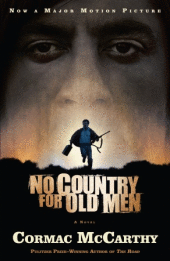
By comparison, the “movie tie-in” cover is far more explicit. It retains the running figure, but gives him the satchel of money and a rifle. The sun has sunk lower in the sky, shrouding him in an eerie darkness which allows the personified malevolent force, Javier Bardem’s Anton Chigurh, to appear like a ghost in the night sky. It almost looks like Bardem is going to snort Josh Brolin right up his nostrils.
Comparing the two, I find myself turned off by the sterility of the “literary” cover. It comes off as dry and academic. The “movie tie-in” cover actually does an exceptional job of balancing the goal of marketing the film while retaining some independent aesthetic value and capturing the essence of the novel.
What saves it, in my opinion, is the cautious use of the film’s two starring actors, Josh Brolin and Javier Bardem. The manner in which their images are employed on this cover is tasteful and deliberate; neither is totally visible and their presence is subordinate. The cover isn’t primarily a showcase for the actors or even the movie, as many “movie tie-in” covers tend to be. The movie imagery is used effectively, without making it look like the book cover is just an advertisement.
The new cover is about the story of No Country for Old Men and nothing more. The original cover is too mannered to do much more than thinly allude to the violent, raucous events of the novel with its bloody sky; the “movie tie-in” cover confronts the narrative. This is a story about a man fighting for survival against a seemingly omnipresent, larger-than-life antagonist. It’s explicit, and it’s scary.
Both covers share the setting-sun motif, but while the original allows the sun to just peek over the horizon, the “movie tie-in” cover buries it out of sight, with only a thin strip of ambient light hinting at its existence. The slight difference enhances the dread, as if to say that time has already run out, and when that dusklight finally recedes, there will be nothing to protect the running figure from the spooky visage that looms above him.
As someone who once took great pains to avoid “movie tie-in” covers, I’m heartened by the cover design for this edition of No Country for Old Men. I shouldn’t be surprised that such care and attention is being paid to giving proper respect to the novel; the Coen’s film treatment is so devoted to it, it’s clear that the entire project is focused on not sullying its stature. Hopefully that’s a sentiment which spreads to other adaptations and “movie tie-in” covers in the future.
[tags]No Country for Old Men, Cormac McCarthy, Book Review, Book Design[/tags]